Save 20% on COAT Paints with Lorna Syson: Wallpaper and Paint Colour Ideas
Choosing a wallpaper or fabric you love is an exciting starting point for decorating. But what paint should you put with it? Whether you want a soft backdrop or a confident splash of colour, choosing your paint alongside your pattern helps bring the whole room together.
I’m delighted to offer Lorna Syson customers an exclusive 20% discount on COAT paints. I can pass this saving on to you, helping your decorating budget go a little further while you create a home full of colour and personality.
To inspire your next project, I’ve brought together some suggested COAT paint pairings for my Wren & Cherry, Spring Ivy Blue, Hydrangea and Goldcrest designs.
How to access your 20% COAT paint discount
If you’re planning a decorating project, get in touch with me before placing your COAT paint order. I’ll explain how to access the 20% saving and confirm the offer details for your purchase.
Let me know which Lorna Syson wallpaper or fabric you’re considering, too. It’s always lovely to hear about your decorating plans and discuss the colours you’d like to bring into your home.
Choosing paint colours to go with patterned wallpaper
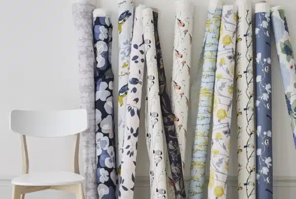
My designs take inspiration from British birds, flowers and the nature we encounter every day. Within each pattern, you’ll find colours that can guide the rest of your room.
You might continue the wallpaper’s background colour onto neighbouring walls, pick out a smaller detail for painted furniture or introduce a deeper shade through panelling and woodwork.
The combinations below are suggested coordinating colours rather than exact colour matches. Compare physical paint samples with your wallpaper or fabric sample before deciding, as lighting and existing furnishings will influence how they look.
Wren & Cherry with COAT Granny Chic and 2AM
Wren & Cherry features little wrens amongst cherry branches, combining a blush pink background with contrasting navy details. It’s a design that offers plenty of scope for both gentle and bolder decorating schemes.
Granny Chic: embrace the pink
Granny Chic is COAT’s pale pink with a grey edge. It’s a lovely option to explore if you want to continue the soft pink palette beyond the wallpaper.
I would try Wren & Cherry wallpaper behind a bed with Granny Chic on adjoining walls. Plain bedding, timber furniture and a navy throw could connect the colours while allowing the birds and branches to remain the focus.
2AM: add a deeper blue
For a stronger contrast, try 2AM, COAT’s dark royal blue. COAT also recommends this shade alongside pale and dusky pinks.
I would explore it on panelling beneath Wren & Cherry wallpaper, a fitted wardrobe or a painted sideboard. Introducing blue through a substantial piece of furniture can give the room depth and repeat the darker details within the pattern.
Spring Ivy Blue with COAT Park Life and Mr. Clifton
Spring Ivy Blue was inspired by ivy cascading down a Georgian house on my walk to the studio. Its blue tits and trailing foliage offer a wonderful starting point for a nature-inspired interior.
Park Life: bring out the foliage
Park Life is COAT’s deep sage green. I would sample it alongside Spring Ivy Blue to explore a leafy colour scheme that carries the garden inspiration across the room.
Consider it for adjoining walls or painted panelling beneath the wallpaper. Natural wood, woven textures and plain upholstery would help the pattern stand out while adding warmth.
Mr. Clifton: explore a layered blue scheme
Mr. Clifton is a grey teal, described by COAT as a warm blue. It offers another direction if you want to explore the blue tones within Spring Ivy Blue.
I would try it on cupboards, woodwork or neighbouring walls. Together with the wallpaper, it could create a layered palette with the birds and ivy as the focal point.
If you’re introducing Spring Ivy Blue through fabric or a lampshade, either paint colour could provide a backdrop for a smaller amount of pattern.
Hydrangea with COAT Modest and Lie-in
My Hydrangea design draws on memories of my grandmother’s garden and hydrangeas spilling over garden walls in Penzance. The pink, blue and purple flower heads offer several colours to explore when decorating.
Modest: a gentle neutral backdrop
Modest is COAT’s taupe off-white. I would sample it alongside Hydrangea for a scheme where the flowers take centre stage.
Try it on adjoining walls with Hydrangea wallpaper as a feature, adding timber furniture and simple textiles. A quieter painted backdrop gives you room to enjoy the floral details without needing to introduce lots of additional colour.
Lie-in: continue the blue tones
Lie-in is a light blue with a touch of grey. It’s a lovely shade to explore if you want to draw attention to the blue tones within the Hydrangea design.
I would consider it for painted panelling, cupboards or neighbouring walls. You could also use Lie-in throughout a room and introduce Hydrangea through fabric or a lampshade, letting the flowers provide the pattern.
Goldcrest with COAT Ziggy’s Yellow and Mindful
Goldcrest was inspired by tiny birds moving amongst pine needles. Its gentle greys, beige and brown tones provide a starting point for a room filled with natural colour and texture.
Ziggy’s Yellow: introduce a cheerful accent
Ziggy’s Yellow is COAT’s soft mid yellow, with a muted warmth. I would explore it alongside Goldcrest to introduce a cheerful accent while keeping the delicate pattern in focus.
Try it on a painted cupboard, bedside table or panelling. A smaller area of yellow can bring a welcome lift to a room and give a favourite piece of furniture a new lease of life.
Mindful: keep the palette soft
For a quieter pairing, Mindful is a very pale taupe with an earthy warmth. I would sample it on adjoining walls, adding timber furniture and woven textures to complement Goldcrest’s natural palette.
You could also explore all three together: Goldcrest wallpaper as the focal point, Mindful on surrounding walls and Ziggy’s Yellow on a piece of furniture.
Start with wallpaper and paint samples
Before settling on your colour scheme, bring your samples together in the room you’re decorating.
Place the paint beside your wallpaper or fabric sample, then compare them with your flooring, curtains and furniture. Look at the combination in daylight and under your evening lighting, as the balance can change throughout the day.
If you’re choosing a paint for a particular wall or cupboard, position the sample there. Seeing colours upright and in their intended location is much more useful than looking at them flat on a table.
Take your time. You’re choosing colours you’ll live with and enjoy every day.
Bring your decorating plans together and save 20%
Whether you love the pink and navy of Wren & Cherry, the leafy character of Spring Ivy Blue, the flowers of Hydrangea or the delicate details of Goldcrest, your favourite design can guide a whole room.
Get in touch to find out how to access your exclusive 20% COAT paint discount, and tell me which Lorna Syson design has caught your eye.
Explore the Lorna Syson wallpaper collection to discover your favourite pattern and start planning your colour scheme.