Wren & Cherry Wallpaper: Inspiration and Paint Colours to Pair With It
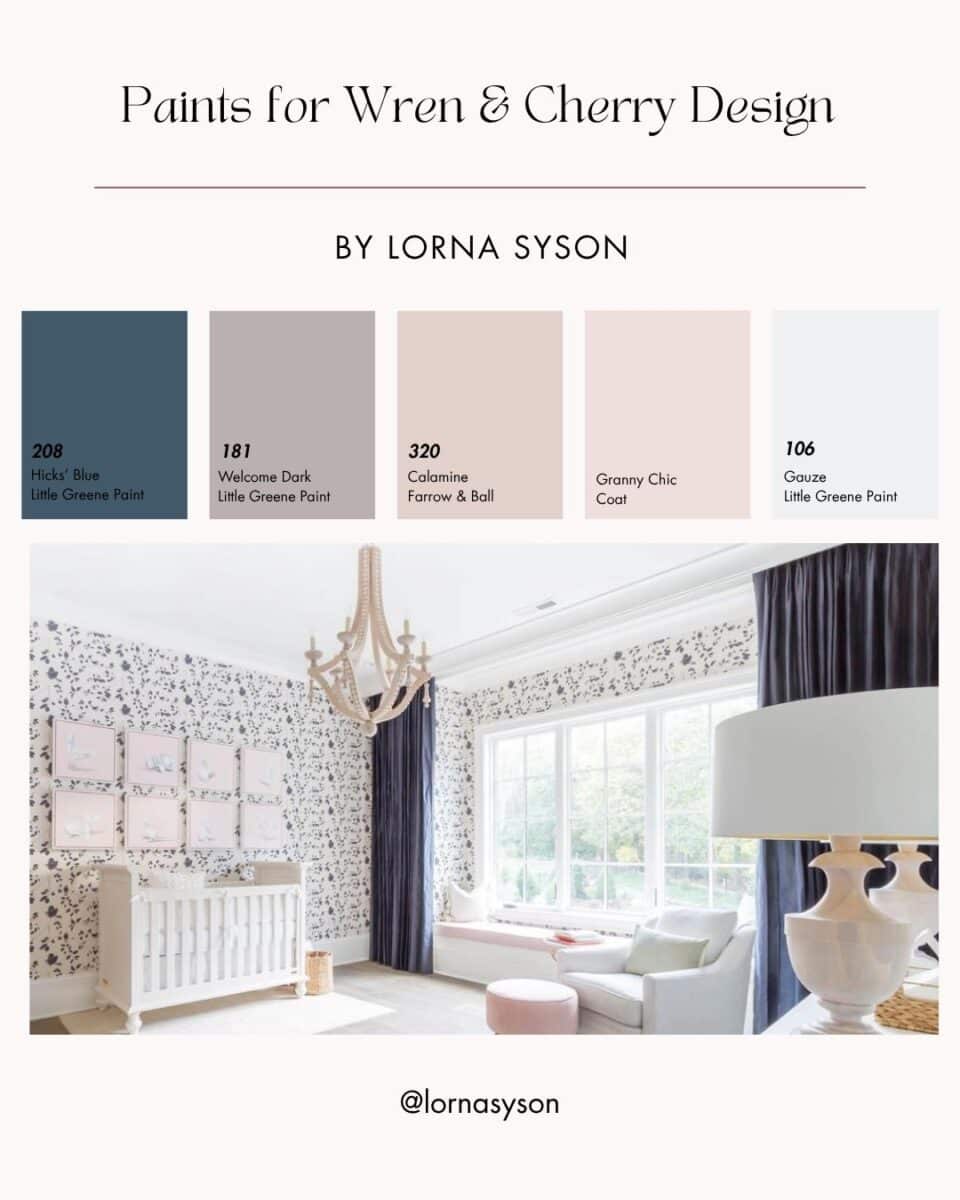
There is so much inspiration to be found in a British garden. I love to bring the branching shapes, changing colours, and little birds going about their day into my designs.
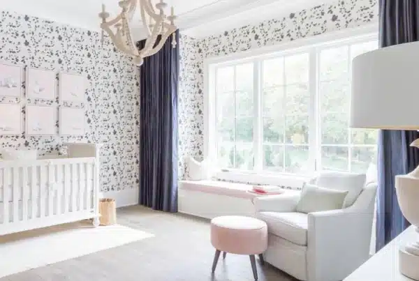
My Wren & Cherry design features little wrens searching for food among cherry tree branches, with a blush-pink background and contrasting navy details. Part of my Garden collection, it brings a little of the outdoors into your home through pattern and colour.
Whether you are planning a bedroom, adding character to a living room or looking for pink bird wallpaper with a more grown-up feel, Wren & Cherry offers a lovely starting point.
Wren & Cherry Wallpaper: Paint Colour Pairings | Lorna Syson
The inspiration behind Wren & Cherry
My Garden collection grew from my love of British gardens, from the carefully considered planting of formal gardens to the smaller outdoor spaces closer to home.
With Wren & Cherry, I combined garden birds and cherry branches with a palette of blush pink, navy and grey. When I first introduced the design, I wrote about pink being a colour I didn’t naturally gravitate towards. Pairing it with navy and grey helped me explore a softer palette while keeping the overall look balanced.
That balance is something you can carry through into a room: let the pink bring softness, use blue for depth and introduce quieter colours wherever you want a little breathing space.
Paint colours to pair with Wren & Cherry wallpaper
The blush pink background and navy details of my Wren & Cherry design offer several directions for decorating. You can embrace the pink, introduce a deeper blue or choose a quiet neutral that gives the birds and branches room to shine.
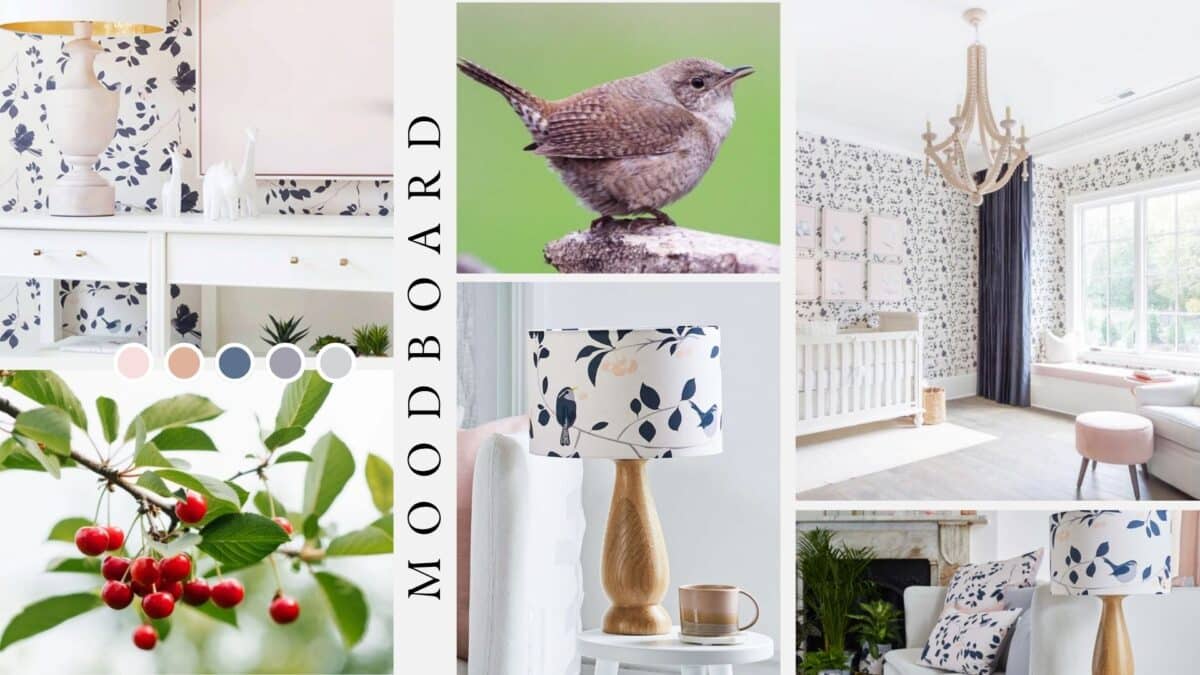
Here are my suggested coordinating colours from Little Greene, Farrow & Ball and COAT. Always compare physical paint samples with your wallpaper or fabric sample in your own room before making your final choice.
Little Greene: Hicks’ Blue
For a bold contrast, try Hicks’ Blue, a deep blue that I would use to draw attention to the darker details within Wren & Cherry. Consider it for painted panelling beneath the wallpaper, fitted cupboards or a statement piece of furniture. The combination would create a lovely balance between soft pink and a stronger blue accent.
Little Greene: Welcome – Dark
If you would prefer a quieter scheme, Welcome – Dark is a grey shade worth sampling alongside the design. I would explore it for adjoining walls, keeping the wallpaper as the main feature and adding navy accessories to connect the room’s colours.
Little Greene: Gauze
Gauze offers a lighter option. Little Greene describes it as a cool off-white, making it an interesting starting point for a more restrained palette. I would try it beside a Wren & Cherry feature wall, with natural wood and plain textiles to keep the overall feel relaxed.
Farrow & Ball: Calamine
Calamine is a delicate pink with a touch of grey, which keeps it from feeling too sugary. I would sample it alongside Wren & Cherry for a bedroom or reading corner where you want to continue the soft pink palette beyond the wallpaper. Add navy through a throw, lamp or painted bedside table for definition.
COAT: Granny Chic
COAT’s Granny Chic is a pale pink with a grey edge. It is a lovely colour to explore if you want to embrace pink while keeping the room feeling grown-up. I would pair it with Wren & Cherry, simple furniture and blue accents, allowing the pattern to remain the focus.
Our exclusive COAT paint discount
We also have an exclusive COAT paint discount to help you bring your decorating plans together. Get in touch for details of the offer before placing your paint order.
For 20% off use the code CCLORNAS20 for my exclusive discount!
Sample your colours together
These are suggested colour pairings rather than exact matches. Place your paint samples beside your Wren & Cherry wallpaper sample and look at them in both daylight and evening lighting. Comparing them with your flooring, furniture and textiles will help you choose a combination that works for your home.
Wren & Cherry Wallpaper: Paint Colour Pairings | Lorna Syson
How to style Wren & Cherry in your home
A welcoming bedroom
Use Wren & Cherry wallpaper behind the headboard and choose a coordinating pink for the remaining walls. Plain bed linen will give the pattern space, while a navy throw or bedside lamp can repeat the darker details.
For a more immersive effect, consider wallpapering the whole room and keeping furniture and textiles simple.
A living room with personality
Pair the wallpaper with a plain sofa and introduce blue through an armchair, painted shelving or accessories. Timber furniture and woven textures can add warmth without introducing another competing pattern.
You can also explore the design through fabric and lampshades if you would prefer a smaller amount of pattern.
A colourful corner
You don’t need to decorate an entire room to enjoy a favourite design. A wallpapered alcove, a reading corner or a patterned lampshade beside a comfortable chair can bring birds and colour into an everyday space.
Start with a Wren & Cherry sample
Before committing to your paint, order a Wren & Cherry wallpaper sample and build your palette around it.
Place the wallpaper and paint samples together in the room you are decorating. Look at them in daylight and under your evening lighting, and compare them with the flooring and furniture you plan to keep.
My Wren & Cherry wallpaper is printed in the UK on non-woven paper and uses a paste-the-wall application. Whether you choose one feature wall or a room full of pattern, it is a way to bring British garden inspiration into your home.
Explore Wren & Cherry wallpaper and start planning your own pink and blue interior.